This is the final part of our four part series on Material-UI. In this post we look at the variability in the project, how this variability is managed and how it is implemented. This is all done to show the range of possibilities in Material-UI. We will then finish with our assessment on how well the variability has been implemented in this project.
Features with variability
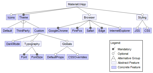
We identified the following main variable features for Material-UI:
- Supported browsers. This feature benefits the final end-user the most since it allows them to use their favourite browser to access websites created with Material-UI.
- Themes. This allows developers to quickly use a given theme without having to pay much attention to styling individual components.
- Colour palette1, allowing developers to alter the colour schemes of their chosen or custom themes.
- Dark mode1. With this feature developers can easily create a dark mode for their users, which in turn also benefits the end-users.
- Typography (font, font size, variations)2, providing ways to alter the way text is rendered.
- CSS overrides3. These allow developers to inject CSS overrides for styles.
- Default props3, which specify the default props of components. Developers can change these to modify default behavior.
- Component variation4. This feature allows developers to create variants of existing components with special styling.
- Style using CSS or JSS5. With this functionality developers can choose to either use CSS or JSS for styling.
- Material-UI Icons. This optional package allows developers to use a pre-made set of icons that match the Material Design style.
Incompatibilities
Since most of the different variability features in Material-UI are related to spacing, we mainly find different ways of achieving the same result that could cause conflict. The main way this is resolved is by giving precedence to the different ways of varying. A program built using Material-UI may for instance use a custom theme (which already overrides the default theme) which overrides a certain CSS attribute for every style injected by Material-UI, which may override a certain default property override in a theme3. Every component can in turn be given its own styling and when an instance of said component is created, it can be given even more styling overriding all previous set styles4.
All other features that are not directly linked to styling do not interfere with each other and thus can be used with little regard to the configuration of other features.
Feature model
Variability management for different stakeholders
When analyzing the variability management for different stakeholders, we will focus on the end-users and the developers. We consider the end-users to be the people who use Material-UI in their own projects, and the developers are the people working on Material-UI. The other groups of stakeholders will generally have less direct interactions with the variability of Material-UI.
Material-UI provides the following sources of information to both the end-users as well as the developers:
- The official documentation of Material-UI. Information on how to set up the project to your likings can be found here, as well as more information on how to customize the components that Material-UI offers.
- Several example projects that can be used as references are included in the repository6.
- Each release of Material-UI will include more information on the changes, as well as a reference to the pull requests that were relevant for the changes. This way both the PR itself as well the summary of the changes can be used as a source of information.
- If the users would run into any issues for which they cannot find an answer in the provided documentation, they can ask the question on Stack Overflow with the tag
[material-ui].
Mechanisms to ease variability management
Material-UI has two mechanisms in use that do not directly target variability management, but do ease the process a bit. These are present in the form of checks on pull requests.
- CodeSandbox. Each version of a PR is deployed to CodeSandbox which allows the developers to showcase the changes and test the functionality. This enables the reviewers to check different configurations used.
- BrowserStack. Each version of a PR is also tested on multiple platforms. These include Chrome(Headless), Firefox, Safari, and Edge. Each instance is then tested using Karma.
Variability implementations
Let’s take a look at how some of these variables are implemented, and when they are bound (set). We will discuss two types of variables here, with one being determined at compile time and one being decided at run time.
First, let’s take a look at the platforms that Material-UI supports. This is a characteristich that, in the modern JavaScript ecosystem, is very much dependent on the build configuration that is used. Although JavaScript is standardized by Ecma International under the name ECMAScript7, there are currently many implementations, which, depending on their age, may or may not support certain modern features.
To combat this problem, many developers use source-to-source compilation techniques. New and modern language features are translated into more primitive versions (when possible), so that older runtimes can run this newer code as well. Material-UI does this through a tool called Babel8, allowing Material-UI to run on older browsers. There are limitations and drawbacks however. The bundle size increases, and not all language features can be backported. Typically, support for very old or unsupported runtimes is eventually dropped. It is expected that a next major version of Material-UI will no longer support Internet Explorer, for example.9
Secondly, we’ll discuss how developers can customize the styling of Material-UI. The project provides an API that allows developers to create theme objects. Such theme objects specify what the color palette of the application looks like, how the typography is defined and should behave, and many more things that can impact the visuals of the final application. This is an example of configuration that is not defined at build time, but at run time instead.
The most common way to implement such customization for Material-UI is to first create a theme object using the aforementioned API.
A developer can specify the values they’d like to use, and any values that are not specified default to the values set by the project.
This object can then be loaded into a ThemeProvider component, which will then use React’s Context API to create a theme context.
All child nodes of the ThemeProvider can then use this ambient theme object to apply theming options such as colors.
The nature of React contexts also allows such themes to be hot-swapped while the app is running; React will automatically re-render changed components.
Variability and the future
The current future plans are to implement more customization by various means:
- Using styled-components, which would allow more usage of 3rd party libraries10.
- Allowing the Box props to be used in all core components11.
- Allowing the use of dynamic theme variants and colors12 13.
- Allowing the use of the components without any styles and instead use themes that decide the style14.
- Improve the support of custom breakpoints, which will allows more control of behavior with different screen sizes15.
The nice thing is that these changes independently add functionality, and are therefore good choices for adding more variability. The downside is that these are quite extensive changes that need large overhauls.
The cost of making extensions that allow more variability is relatively low in this project. Because Material-UI uses a component and layer based architecture, adding a new components generally only requires tests for the added components. Therefore it is relatively cheap to maintain a proper test suite during extensions of the project.
The binding time would be determined through how these features will be implementend in the core of the project. Thus, for these extensions it is only needed to implement variability for the specific parts that are added by the extension.
Conclusion
We conclude this essay by establishing that Material-UI allows for a wide range of variability, with the project running on multiple platforms, allowing for many different styles, and supporting many different combinations of component usage. This is achieved by combining compile-time solutions with run-time options developers can make use of. The project is generally unopinionated, and allows consumers of the project to use it in any way they please through the wide range of customizable settings.
Although Material-UI does use its own custom styling solution, it does not force developers to use this solution. While the authors recommend the usage of its own styling system to reduce the final bundle size, it is entirely possible to use a style the user interface with code unrelated to Material-UI. We do not have any recommendations on making the project more variable besides the ones Material-UI lists in their issue tracker.
-
https://material-ui.com/customization/typography/ ↩
-
https://material-ui.com/styles/advanced/ ↩
-
https://material-ui.com/getting-started/example-projects/ ↩
-
http://www.ecma-international.org/publications/standards/Ecma-262.htm ↩
-
https://github.com/mui-org/material-ui/blob/cc3b03becb98902b027026081e01832b009e7507/babel.config.js ↩
-
https://github.com/mui-org/material-ui/issues/14420 ↩
-
https://github.com/mui-org/material-ui/issues/6115 ↩
-
https://github.com/mui-org/material-ui/issues/15561 ↩
-
https://github.com/mui-org/material-ui/issues/15573 ↩
-
https://github.com/mui-org/material-ui/issues/13875 ↩
-
https://github.com/mui-org/material-ui/issues/6218 ↩
-
https://github.com/mui-org/material-ui/issues/11649 ↩