In this second part of our series we will consider the overall architecture of Material-UI in-depth. First, we will consider what viewpoints can be used for an in-depth look. Secondly we will consider the main style of the architecture and then we will use that information to consider some viewpoints. Finally we consider the non-functional properties of Material-UI.
Viewpoints
We will consider possible interesting architectural viewpoints as described in Rozanski and Woods1. In the previous post we already have considered the context, the rest we will shortly evaluate for their usefulness in relation to Material-UI
- Functional - This is relevant as it is the cornerstone for any project.
- Information - The project provides no functionality intended to store information and therefore we don’t need to consider this viewpoint.
- Concurrency - React is currently working on a concurrent mode, and in turn Material-UI developers have worked on preparing compatibility with this new feature. The main coordination and control of this concurrency however is provided through React, and it is therefore more useful to consider this as an additional constraint or requirement for Material UI. We conclude that this viewpoint is not fitting for Material-UI.
- Development - We have already seen part of this in the previous post in the context when we saw tools such as GitHub.
This viewpoint is especially interesting as there is a great focus on community as seen previously in the roadmap. - Deployment - Material-UI does have some technical requirements to use the full functionality, for example the need for Node.js to allow server side rendering, and therefore this view is interesting to consider.
- Operational - As Material-UI is essentially a library of components there is no operational support required besides fixing eventual bugs, which can be covered in the development view as maintenance.
Architectural Style
Material-UI’s architecture can be characterised best by the layered architectural style2. The various UI components extend a core component that provides some base functionality. While this might seem like a very simple architecture, getting such a set-up to function properly is complex and forces many constrainsts on the form of the components.
The goal of the developers is to provide low-level components to maximize composition capabilities3. The API of these components are designed to be as similar to one another as they can be, making the library more consistent. Some components are exceptions to this however. As some components use composition to re-use smaller components, their APIs may be inconsistent to simplify their interface, or to improve performance.
Development View
The Material-UI project consists of multiple different components. We shall first give a brief description of each component before giving an overview of how the components depend on each other.
- core: This component provides all React components4 and is the primary component that end-users will interact with.
- styles: This component provides Material-UI’s styling which can used independently from the core component if users want to5.
- system: This component provides so called style functions which can be used to create design systems6.
- types: This component provides utility types for Material-UI7.
- utils: This component provides utility functions for Material-UI8.
- icons: This component provides Google’s Material icons as React components which can be used independently of the core package9.
- lab: This component contains React components that are currently under development10.
- docs: This component contains documentation building blocks11.
- codemod: This component is a tool which can help with automatically updating Material-UI’s API usages12.
- eslint-plugin: This component contains numerous ESLint rules specifically for Material-UI13.
- babel-plugin: This component is a tool used to automatically converts Material-UI’s TypeScript demos to JavaScript demos14.
We will now present a visual overview of how the different components depend on each other:
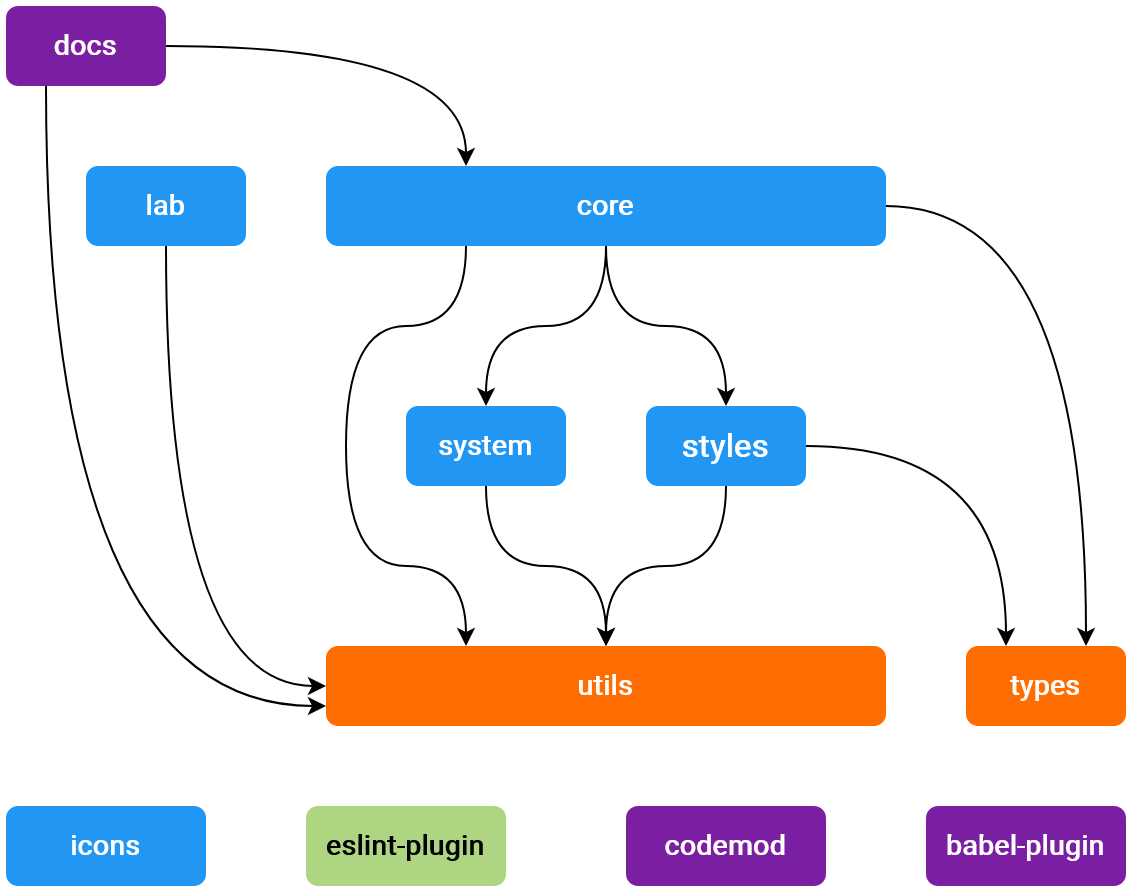
Figure: Material-UI Components
If a component has an arrow pointing towards another component it means that it depends on the component to which the arrow is pointing. The colour of the component indicates whether a component is meant for direct consumption (blue), not meant for direct consumption (orange), meant for adding support to external tools (green) or meant to help develop or document Material-UI (purple).
Run Time View
At run time, each component can be loaded and used. Depending on the build system of the software project that is using Material-UI, it can either be loaded as one big bundle of components, or it can be loaded as part of the built software project bundle. As many modern React projects are built using a so-called module bundler such as webpack or rollup.js, this is the recommended approach for using Material-UI.
It is typically not possible to interact with the provided components directly. In virtually all cases, a developer declares that a component must be rendered, and React will take care of managing the component behind the scenes15. Developers can specify props that influence how a component behaves or looks16. Most of these components are self-contained, and thus fit in nicely with the idiomatic component structure that React recommends.
All of the components can be composed together with the developer’s own components to present the user with a complete user interface.
Material-UI does this as well, as some components use other components.
For example, the IconButton component makes an appearance in several other components.
There are no circular dependencies however; the architecture of the library remains layered.
Such composed interfaces can be as complex or simple as needed, since React handles most rendering use cases. Examples can be seen on Material-UI’s Showcases documentation page17. When user interfaces become very large however, the performance of the web page is affected. Such issues can be solved by optimizing component use, or using UI virtualization.
Deployment View
Because Material-UI is a library, it is not necessary to deploy many different services. However, every pull request to the GitHub repository does trigger a check that automatically deploys a preview of the website using Netlify18. Likewise, every merged pull request deploys the updated documentation pages to Material-UI’s production website, again using Netlify and GitHub workflows19.
Furthermore, the actual library itself is published on npm as multiple different packages. Each of the different components corresponds to one of the npm packages20212223242526272829. Each npm package is manually and seperately deployed, as can be seen by looking at the difference in release dates between the packages and between the latest merged pull request altering said components.
Non functional trade-offs
There is no free lunch in computer science, which also holds for any software project. Some trade-offs can be found in Material-UI when looking at the non-functional properties that are relevant for this project. One of such property is the number of components. Material-UI would like to include all the components that are commonly used by developers. However, the downside of expanding their library is that the size of the bundle will increase. To mitigate this trade-off the developers of Material-UI have spent their time looking into ways to reduce the bundle size and has set this as one of their priorities. While version 4 had more components in it, its size was reduced by 18% compared to version 330.
Material-UI puts a lot of emphasis on having the components work in isolation and they want their API to be as low-level as possible31. This means that sometimes their decision will be to include fewer features, rather than including features that do not work in isolation, are not performant, are not easily customizable, or are not accessible. In these cases they would encourage the user to build these extensions on top of the library instead.
-
https://www.viewpoints-and-perspectives.info/home/viewpoints/ ↩
-
https://www.oreilly.com/library/view/software-architecture-patterns/9781491971437/ch01.html ↩
-
https://material-ui.com/guides/api/ ↩
-
https://github.com/mui-org/material-ui/tree/master/packages/material-ui ↩
-
https://material-ui.com/styles/basics/ ↩
-
https://material-ui.com/system/basics/ ↩
-
https://github.com/mui-org/material-ui/blob/master/packages/material-ui-types/package.json ↩
-
https://github.com/mui-org/material-ui/blob/master/packages/material-ui-utils/package.json ↩
-
https://github.com/mui-org/material-ui/tree/master/packages/material-ui-icons ↩
-
https://github.com/mui-org/material-ui/tree/master/packages/material-ui-lab ↩
-
https://github.com/mui-org/material-ui/tree/master/packages/material-ui-docs ↩
-
https://github.com/mui-org/material-ui/tree/master/packages/material-ui-codemod ↩
-
https://github.com/mui-org/material-ui/tree/master/packages/eslint-plugin-material-ui ↩
-
https://github.com/mui-org/material-ui/tree/master/packages/babel-plugin-unwrap-createstyles ↩
-
https://reactjs.org/docs/state-and-lifecycle.html ↩
-
https://reactjs.org/docs/components-and-props.html ↩
-
https://material-ui.com/discover-more/showcase/ ↩
-
https://github.com/mui-org/material-ui/pull/20076/checks ↩
-
https://github.com/mui-org/material-ui/actions/runs/55958265/workflow ↩
-
https://www.npmjs.com/package/@material-ui/core ↩
-
https://www.npmjs.com/package/@material-ui/styles ↩
-
https://www.npmjs.com/package/@material-ui/system ↩
-
https://www.npmjs.com/package/@material-ui/types ↩
-
https://www.npmjs.com/package/@material-ui/utils ↩
-
https://www.npmjs.com/package/@material-ui/icons ↩
-
https://www.npmjs.com/package/@material-ui/lab ↩
-
https://www.npmjs.com/package/@material-ui/docs ↩
-
https://www.npmjs.com/package/@material-ui/codemod ↩
-
https://www.npmjs.com/package/eslint-plugin-material-ui ↩
-
https://material-ui.com/discover-more/roadmap/#priorities ↩
-
https://survivejs.com/blog/material-ui-interview/ ↩